
Wednesday, May 11, 2011
Illusion of Motion by Multiple Image
Alternating Rhythm

The piece relates to alternating rhythm because of its consistent pattern. You are able to anticipate what will happen next in the piece. What makes this piece perfect to describe alternating rhythm is that it has a predictable quality to it.
Tuesday, May 10, 2011
Illusion of Motion by Blurred Outline

When I think of blurred motion, I typically think of photographs my grandma is taking and someone within it moves. The photo above I feel is a good example because the figure appears to not be in motion, but it is really the people behind who are not moving as fast.
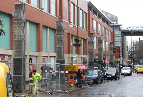
Illusion of Motion by Repeated Figure

Anticipated Motion

Spatial Puzzles

Multiple Perspective

Amplified Perspective

Illusion of Space by Linear Perspective


Illusion of Space by Aerial Perspective

The picture above is successful in illustrating an aerial perspective by using overlapping layers. The various hills that sprout up give off a three-dimensional feel that helps you understand the depth of the background.
Illusion of Space by Vertical Location

Illusion of Space by Overlapping

Using space to create a three dimensional feel is very common in lots of art and movie posters. This particular poster from the movie, The Social Network, uses typography and the top portion of the Facebook page to overlap the leading actor. Without the overlapping objects, this poster would be nothing more than a photograph. However, you are viewing an illusion that makes you feel as if the type is scrolling in front of the actor.
Saturday, May 7, 2011
Scale confusion
Scale confusion makes you stop and think about where the placement of objects should be. We are all accustomed to everything being where it should be. Confusing someone makes them uncomfortable.


Absence of focal point.
There is not much to say about this other than the fact that having no focal point means that your eye can not be drawn to something initially.


emphasis on placement
Like the isolation, placing an object in a particular way dictates how it is perceived. The baseball below is seen as the focal point because it is focused and zoomed in on.


Emphasis on isolation
Isolating an object in a work of art also creates a focal point. The example below takes a circle and removes it from a large group of circles. The isolation points out the difference.


Emphasis on contrast
Emphasis on contrast creates a focal point that makes you see the differences in the same shape.


Crystallographic balance
Crystallographic pattern is a very popular of our culture, think pajama pants or the Vera Bradley purses and bags you might see on campus.


Radial Balance
Radial balance involves an object with consistent extensions. Examples of these are flowers and drawings of the sun.


Symmetrical Balance
For something to be symmetrical there must be continuity on both sides to compensate for each other. This bedroom has a bedside table and lamp that mirror each other.


Variety
Variety can be a combination of things in art. It can involve contrast, emphasis, color and shape.


Continuity
With continuity I feel as if it is different because it must hold up a trend opposed to something that trails, having an ending and beginning.


Continuation

The image above is considered unity through continuation because the showcases and people progressing appear to leave a belief that there is more to see.
Unity through repetition
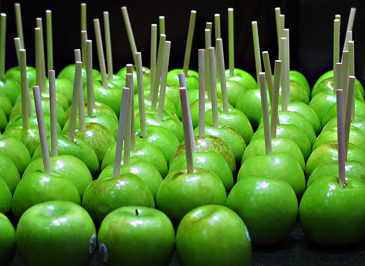
These apples do have their own unique qualities. However, when they are lined up and have sticks punctured in them they become repetitive and and unified.
Unity through proximity
Observe a group of people in a room. You can often learn a lot about who is listening intently to another person, which are strangers, or who is ignoring who by how close together they sit or stand. In design, proximity or closeness creates a bond between people and between elements on a page. How close together or far apart elements are placed suggests a relationship (or lack of) between otherwise disparate parts. Unity is also achieved by using a third element to connect distant parts.

Visual texture
Tactile texture
Texture refers to surface, means surface. Everything that has a surface has texture.


Curvilinear art is characterized by a curving line used to form abstract patterns, such as spirals, circles, swirls, and S-shapes, as well as to define human facial features. The straight line and the right angle are practically nonexistent in both the abstract and the anthropomorphic types of ornamentation.


Friday, May 6, 2011
Rectilinear Shapes

Nonobjective shapes
Nonobjective artwork does not represent or depict a person, place or thing in the natural world. Usually, the content of the work is its color, shapes, brushstrokes, size, scale, and, in some cases, its process.

Abstraction
I know there are abstract painters who say you can hang their art any way you want to--that it works in any direction. But I don't paint that way. Once I get to a certain stage in the process, I keep the same orientation and expect the painting to be hung that way.
On the other hand, occasionally a client wants a print of a square painting in a vertical or horizontal format, and sometimes it works well. Success or failure depends on the design and composition

Idealism

Idealism places special value on ideas and ideals as products of the mind, in comparison with the world as perceived through the senses. In art idealism is the tendency to represent things as aesthetic sensibility would have them rather than as they are.
Distortion

Naturalism

Lost and found contour

Thursday, May 5, 2011
Line as value
Value pertains to the use of light and dark, shade and highlight, in an artwork. Black and white photography depends entirely on value to define its subjects. Value is directly related to contrast. Value is the darkness and lightness of an object depending on how the light is shown.
The picture below uses value in the form of cross-hatching.

The picture below uses value in the form of cross-hatching.

Gesture Lines
A gesture drawing is work of art defined by rapid execution. Typical situations involve an artist drawing a series of poses taken by a model in a short amount of time, often a little as 30 seconds, or as long as 2 minutes. Gesture drawing is often performed as a warm-up for a life drawing session.


Contour line

Line as emotion
Line can be used to convey a variety of emotions. For example, a zig zag can represent angry emotions. A wavier line can also represent an emotion that is safe opposed to a jagged line. Even a straight line can represent a quiet line.

In the picture above it appears that whatever these lines represent is dangerous because of its qualities.

In the picture above it appears that whatever these lines represent is dangerous because of its qualities.
Line direction
The diagonal line has no equal in visual intensity. It suggests depth or movement. The periphery of the eye is very sensitive to movement or to any diagonal, so it calls for complete attention from the viewer. That is why traffic signs designed to warn of hazards are diamond shaped, using diagonals.
Vertical and horizontal lines infer a static or decorative visual condition. An example is a top hat. It appears taller than it is broad, but this is an illusion.

In architecture, the Parthenon in Athens is said not to have a straight line in it. In fact, curved lines are used in many cases to make the straight lines appear straighter. For example, there are three terraces at the bottom of the Parthenon. If they were not curved, they would appear to sag, as they are three inches higher in the middle than at the ends. The builders of the Parthenon placed all the horizontal lines at the bottom, the vertical lines in the middle and the diagonal lines at the top. This creates a decorative design by making the lines appear all on one plane. |
Line as shape
This photo below shows that line is what makes up shape. It also shows the two possible shapes that line can make up, An open shape and and a close shape.


Subscribe to:
Posts (Atom)